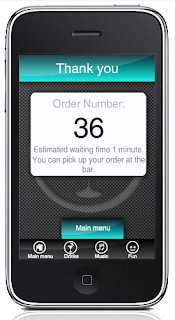
The creation of an Hi-Fi prototype
 In my previous blog post about the ClubAid project, I explained the process we went through before we started constructing our application. I ended the post with a process overview about our Lo-Fi prototype. After testing the Lo-Fi prototype we started building our Hi-Fi prototype, which was based on the Lo-F prototype. However, slightly more work was involved with the Hi-Fi prototype than simply rebuilding the Lo-Fi prototype without its mistakes. We also had to think about various aspects of our application design such as colours, shapes and lay-out. Therefore, we started with an overview of colours which we we found to be satisfying and compared these colours with each other. Eventually we have chosen for colours that matched our logo and combined this with a carbon look background image.
 We then started to work on various icons and shapes that we could use, but since we already had thought about these elements for our Lo-Fi prototype we ‘only’ needed to design them. As soon as all these separate elements were designed we started to build our Hi-Fi prototype. During this phase we were non-stop testing the Hi-Fi prototype ourselves and fixed any issues we came across. As a result, we had a working Hi-Fi prototype based on the wishes of our target group and working as we intended.
The last few weeks we have been evaluating our Hi-Fi prototype with users from our target group as well as experts in the field of User Interface Design. We ran these tests so we would be able improve our application. However, there were no critical remarks which needed to be resolved in our Hi-Fi prototype. We asked the users, on which we ran the tests, to rate their overall satisfaction with our application and we received an average of 6.25 points out of a maximum of 7 points. Although we did not receive the maximum score, we are satisfied with our result and perhaps even more important; we had fun while achieving it.


